The work that I’m going produce will be concept art for a game or walkthrough with virtual reality(VR) 4K monitor. It’s going be in surrealism style and aimed at a target audience between 25-35. The final piece has to be appealing both to the more experienced gamers and to the newcomers in the VR world. I believe that for a more immersive VR experience the game/walkthrough needs to have a lot of detail, to be able to truly feel like ‘a reality’.
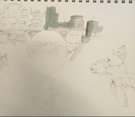
After I read the book I selected 4 cities to further explore by creating sketches.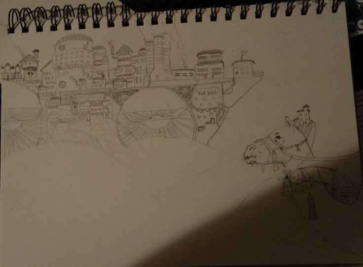 The first sketch is of the city Despina.
Despina can be reached by a camel and it will look like a ship or it can be reached by ship and be viewed as a camel. Knowing this I could have produced 3 sketches and choose one: when it is approached by a ship; when it is approached by a camel; when it is viewed as both. In the end, I only produced this one, because I wanted to have 4 good sketches with a lot of detail of the city and then work one of them.
Obviously, I have chosen the first way, approached by camel. Here Despina is a steamship sailing through the desert.On the upper left half of the ship, you have the rich part of the city, there people live in comfort and have a lot of water supply, indicated by the water towers. Underneath that part is the ‘Dust Zone’. There the lower you live the dustier it is, because of the moving ship. On the whole right of the ship is the worker’s area, in the upper half there factories and different stations that keep the city ‘sailing’ and in the lower half are the living quarters for the main crew. In the top right corner of the city, there is a single house where the captain lives. There is a giant camel that is approaching the ship, with a little city attached to it. This are more workers because the ones in the ‘Dust Zone’ die from the dust.
I like to believe it turned rather well, although there isn’t even remotely any shading done. I have used mainly lines for this sketch apart from the camel.Just the bottom half feels empty.
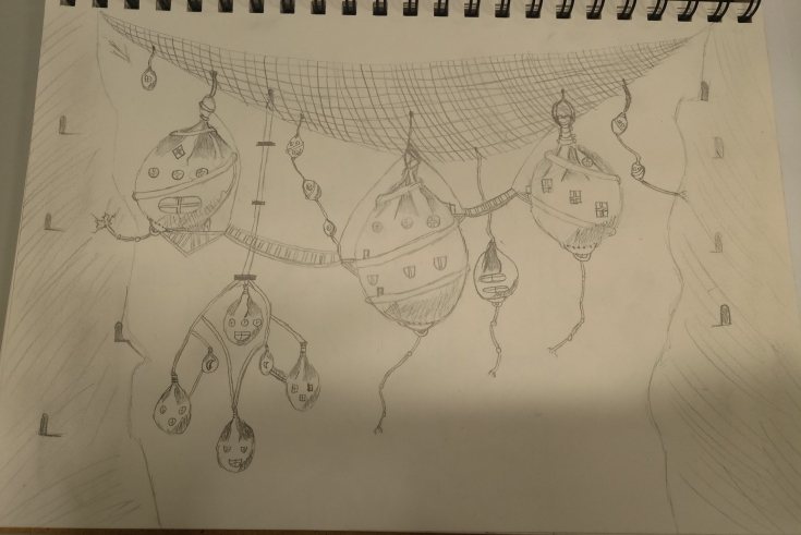 The second sketch is the spider-web city, Octavia.
Octavia is placed on the top of the void between two mountains and it’s residents move throughout it on ropes and bridges. Their houses are something like a big leather sheet wrapped around, tied on top and placed on the big spider-web like rope system, which placed between the mountains.
After doing the sketch like someone would normal picture it, I asked myself for a whole city to be there how does function in a certain way, say strong wind. The houses won’t just swing around (although that would be a good feature for a game), so I added ropes and chains that the houses use to attached one another or to the mountain. After that, I added mine entrances to both of the mountains, because the residents have to mine something in order to trade it for food and other necessities.
I’m not completely sure how I feel about the outcome of this sketch. I have tried to make it look more 3D with shading the wrapped part of the houses, in which I think I have a little success. Other than that it looks like a decent sketch, with enough content and detail for the project it will just need a whole redoing if it is decided for the final piece. I have been using mainly shape for this sketch.
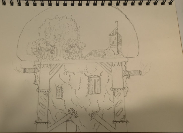
The third sketch is of the city, Baucis.
The city of Baucis is located above the clouds and only long polls like legs touch the ground below. The citizens of Baucis never go back down to the ground, as they have everything they need up there. They only look down on ‘Earth’ and never disturb it with their presence.
From all of the sketches, I spend the most time on this one, because I wanted to do it futuristic like. The reason is that I am better and I prefer to draw from the medieval times to the Victorians times, but decided to do one futuristic in order to explore every opportunity. In my vision of the city, the residents never go back down to the ground, because it is polluted and deadly if the air is inhaled. They use the citie’s ‘legs’ as pipes to take the resources such as: water, dirt, ores. The big chunk of rock is where the poor people live and work as maintenance to the engines and machines that keep the city functioning. On the upper half of the city, there is a big dome, inside it live the rich people of Baucis. Half of it is consisted mainly of a big forest, with its own ecosystem, and of course farms for food and animals. The other half is where the rich people live, there is like a neighborhood where normal people live and then there are two big buildings where the leaders of the cit live.
Again it did take the most time to complete this sketch, which was mostly consisted of wondering how to do it and what would make it look futuristic. I least like from the three sketches. It looks like it is representing two sides of the world, the poor and rich.
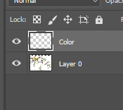
After carefully looking back at the 3 sketches I have decided to go and use the first one as my final piece, Despina. I decided to do something about that empty space.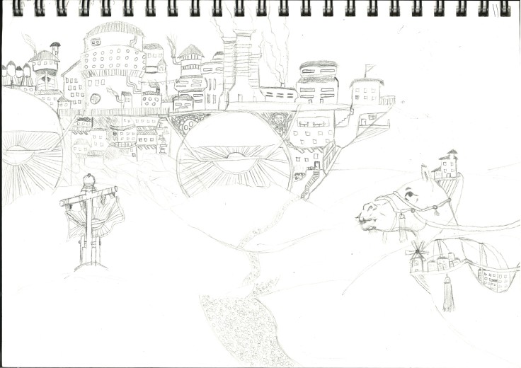
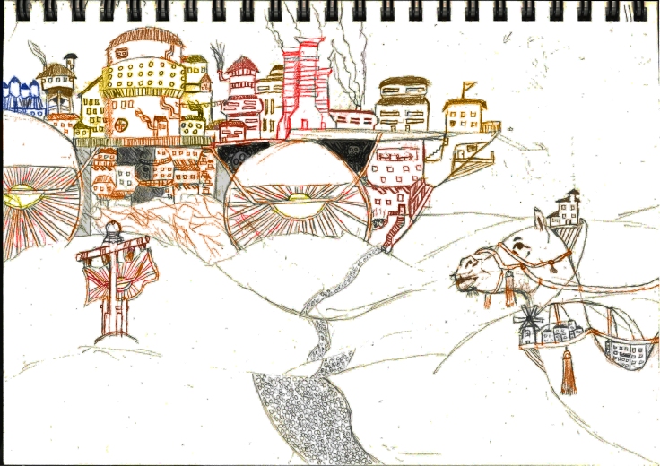
I added a banner that syndicates a place where the city will stop and a path that leads to it. I have also added a few little details like, underneath the captain’s house is a second door with a balcony. And after that I scanned it.
Here I tried to colour it with pens but immediately saw that isn’t going anywhere and just left it liked that. The paint was going everywhere and the point of the setting, which was detail, would have been lost if continued.

Here I just used basic drawing pencils to apply colour to the sketch. The result I don’t hate it’s just not exactly what I was looking or going for. It can still pass for the brief and be used for it. It is just a little childish for me.
 My next attempt was in Photoshop. I opened it and added a second layer for colour, in order not to damage the original and when I need to erase the brush I don’t erase the picture itself. After that, I selected the colour replacement tool and started to colour it.


I instantly noticed it gives is a really different and special look and played a little with the different effects. I mainly altered the contrast of the image.
 This is the final result of the coloured version of Despina. By combing the contrast effect and the colour replacement brush you get a really trippy feeling when looking at the piece. It is like nostalgia of seeing an old photo filled with memories.
 This is the piece with only the contrast effect. I’m not sure which of the two designs is better, black and white or with colour. Both of them give a different and unique feel to the picture.
The coloured one can bring back positives thoughts, whereas the B.W. can gives out this vibe of uncertainty and fear not to go into the city, which can be used for a horror setting.
